The Climate Explorer
Stations
in - Avg Daily Max Temp (°F)
Avg Daily Max Temp (°F)
    Temperature
  • Avg Daily Max Temp (°F)
  • Avg Daily Min Temp (°F)
  • Days w/ max > 50°F
  • Days w/ max > 60°F
  • Days w/ max > 70°F
  • Days w/ max > 80°F
  • Days w/ max > 90°F
  • Days w/ max > 95°F
  • Days w/ max > 100°F
  • Days w/ max > 105°F
  • Days w/ max < 32°F
  • Days w/ min < 32°F
  • Days w/ min > 80°F
  • Days w/ min > 90°F
  • Days w/ min < -40°F
  • Days w/ min > 60°F
  • Precipitation
  • Total precipitation
  • Days w/ > 1 in Precipitation
  • Days w/ > 2 in Precipitation
  • Days w/ > 3 in Precipitation
  • Dry Days
  • Wet days
  • Other
  • Cooling Degree Days
  • Growing Degree Days
  • Heating Degree Days
  • Modified Growing Degree Days
  • Thawing Degree Days
  • Freezing Degree Days
Map
Chart
Map
Chart
  • Map
Annual
Monthly
Annual
  • Annual
  • Monthly
About About the graph About the graph About
Historical Observed
Historical Modeled
Lower Emissions
Higher Emissions
2010-2040 average
2035-2065 average
2060-2090 average

Reading the local climate charts

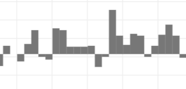
Historical Observed
Observed annual averages, shown as the difference from the long-term average for the late 1900s. The horizontal line from which bars extend up and down is the average from 1961-1990.

Note: Checking how observations vary within the range of historical modeled values can help you recognize how future observations may vary about the range of projected values.
Historical Modeled
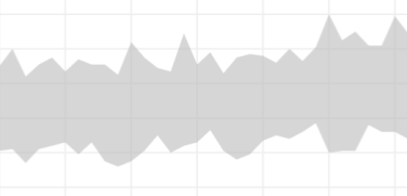
Range of climate model output for historical period (1950-2006). Also called hindcasts or simulations.
Lower Emissions
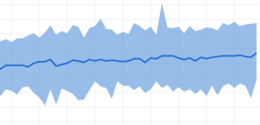
Range of climate model projections for 2006-2100 if global emissions of heat-trapping gases are stabilized by 2040 and then dramatically reduced. Blue line shows weighted mean of all projections at each time step.
Higher Emissions
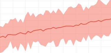
Range of climate model projections for 2006-2100 assuming global emissions of heat-trapping gases continue increasing through 2100. Red line shows weighted mean of all projections at each time step.

How We Represent Global Climate Model Results

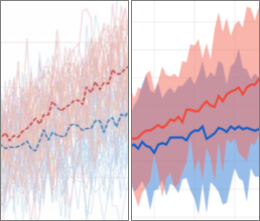
On the left, multiple lines represent the range of global climate model results for each of two possible futures, one in red and one in blue. On the right, the example from Climate Explorer uses single bands of color to show the full range of model results for the same two possible futures.

The top of each color band represents the highest projected value among all the models at each time step for each scenario; the bottom of the band represents the lowest projected value. The dark median line within each band highlights the trend for each scenario, yet future observations are expected to vary across the full range of projections, just as historical observed values vary about the historical modelled values.

ABOUT ALASKA CLIMATE CHARTS

Hindcasts and projections for Alaska come from two global climate models (GFDL-CM3 and NCAR-CCSM4).

  • The historical (modelled) gray band for each Alaska borough shows minimum and maximum values hindcast for the period 1970-2005; actual values have been smoothed by a 10-year rolling average.
  • Projections for 2006-2099 are based on higher emissions (a scenario known as RCP8.5). Again, actual values from the two climate models have been smoothed by a 10-year rolling average.

NOTE: Data displayed on local climate charts for the lower 48 are from the Localized Constructed Analog (LOCA) Statistical Downscaling dataset. LOCA only covers North America from central Mexico through Southern Canada, excluding Alaska. Working with climate scientists as the Alaska Climate Adaptation and Science Center, we selected an alternative data source for Alaska.

The Climate Explorer is optimized for desktop use. Please visit the site on a desktop computer.